Hello! I know this post took a while to come out, but better late than never. This post probably should have come out several weeks ago, but I kind of just forgot about it and moved on, but I’m writing it now!
This session was the second tonal session we did I think, and it involved making a lot of tone charts, and also making a tonal drawing.
I don’t think I did too bad on this one, but looking back on it, I’m surprised I thought it was good at the time. But that does just show how much progress I made throughout the class. I would really really like to do this session again to see how much progress I have actually made and how much better I can do it now.
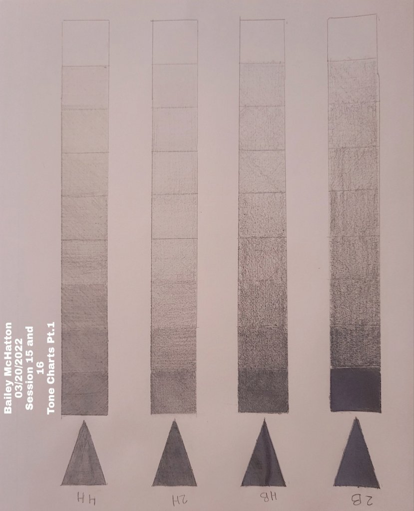
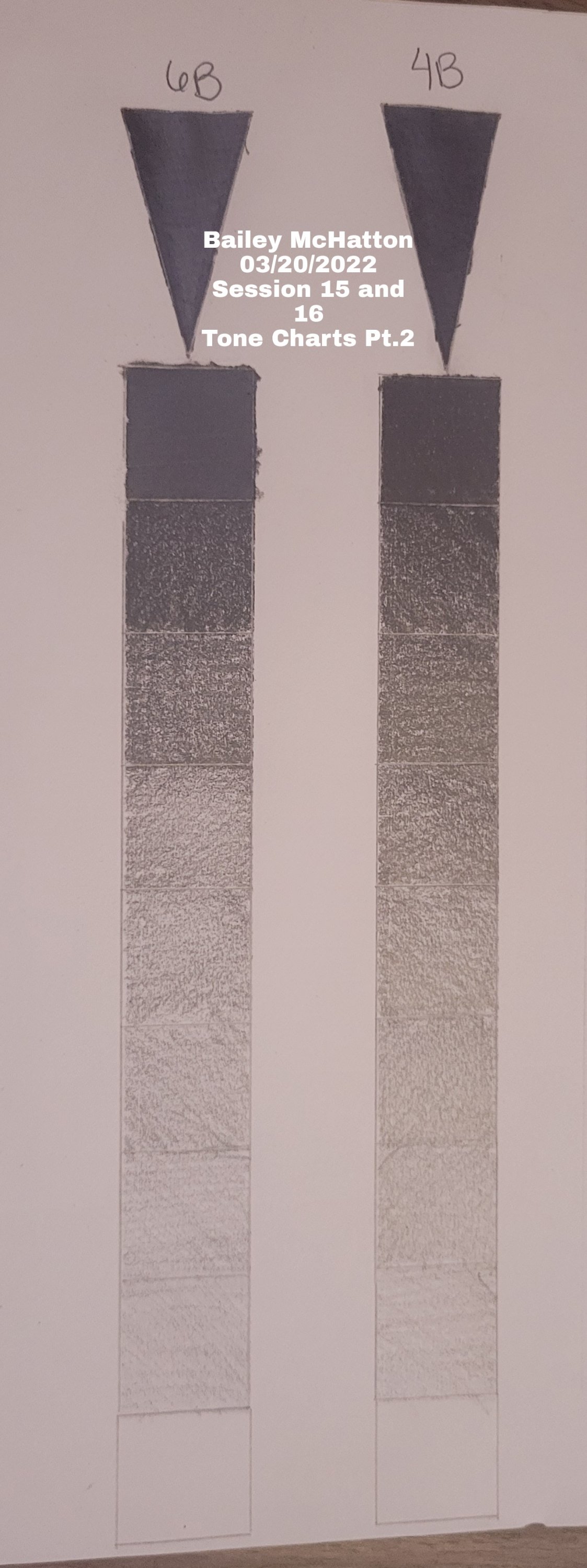
The art kit for the class came with 6 different hardnesses of pencils, so we had to make a tonal chart for each of those. I think the softer pencils were easier, just because it made less sharp lines that I had to work with.
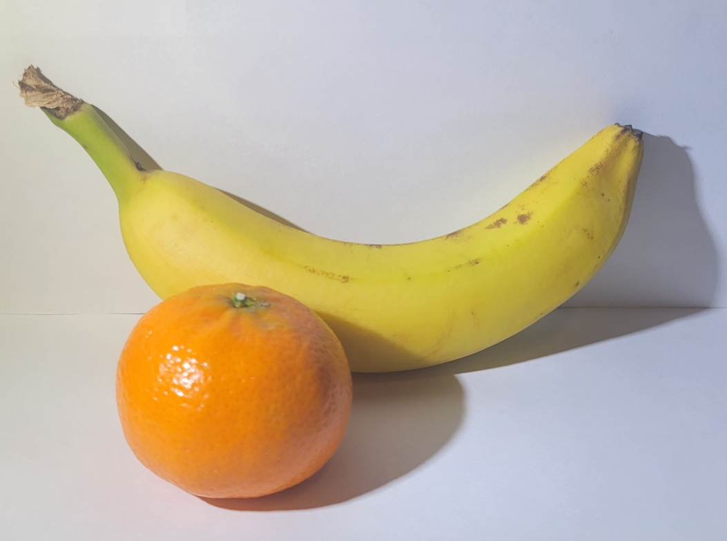
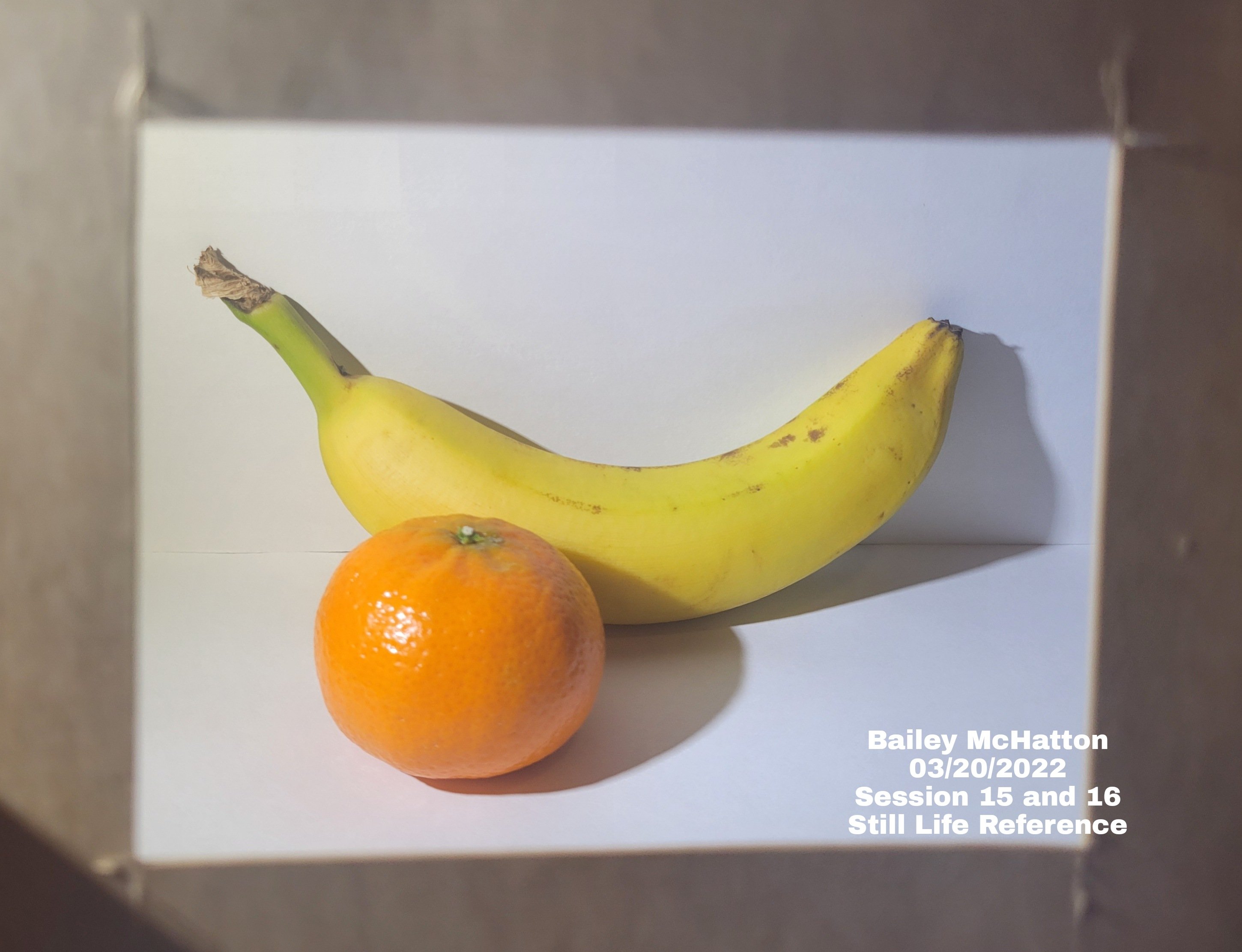
Next up is the tonal drawing. We had to take a lighter fruit and a darker fruit and arrange them on a very light background. That is what is pictured below. I was a little worried about how my orange was my dark fruit, and it didn’t really look that dark. However, it doesn’t really matter anymore haha.
We had to photo document each step of the process, including the tonal sketch, the basic tones, edges, and then final touches. I really do not like following all of these steps, but I do think that it has helped form my drawings better than I could have done without that guidance.
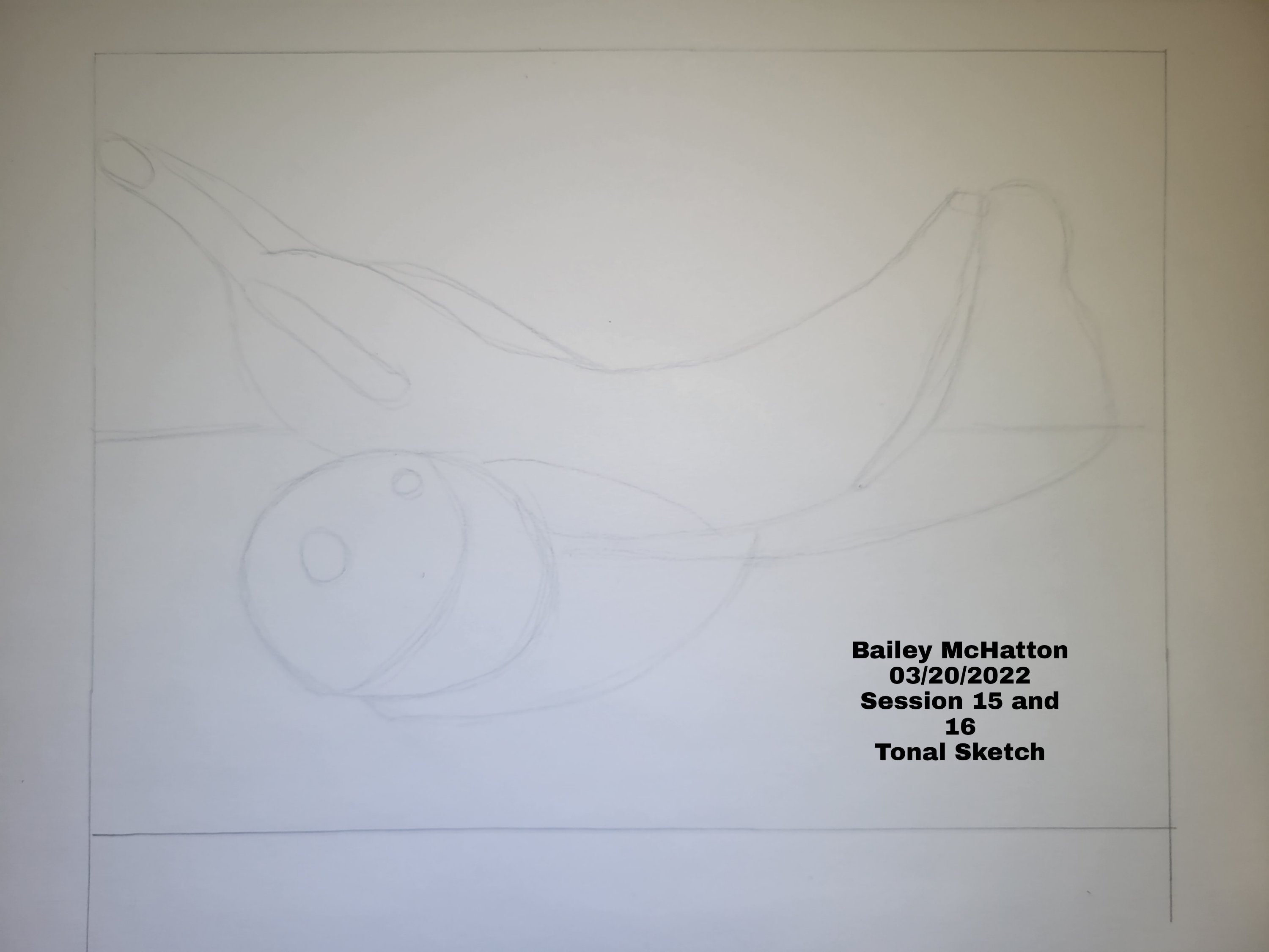
I like this sketch the best out of all of the progress pictures, mostly because it looks the best in my opinion. I really like how the tonal sketch looks in general. The rest of the progress pictures, in my opinion of course, are just downgrades from this.
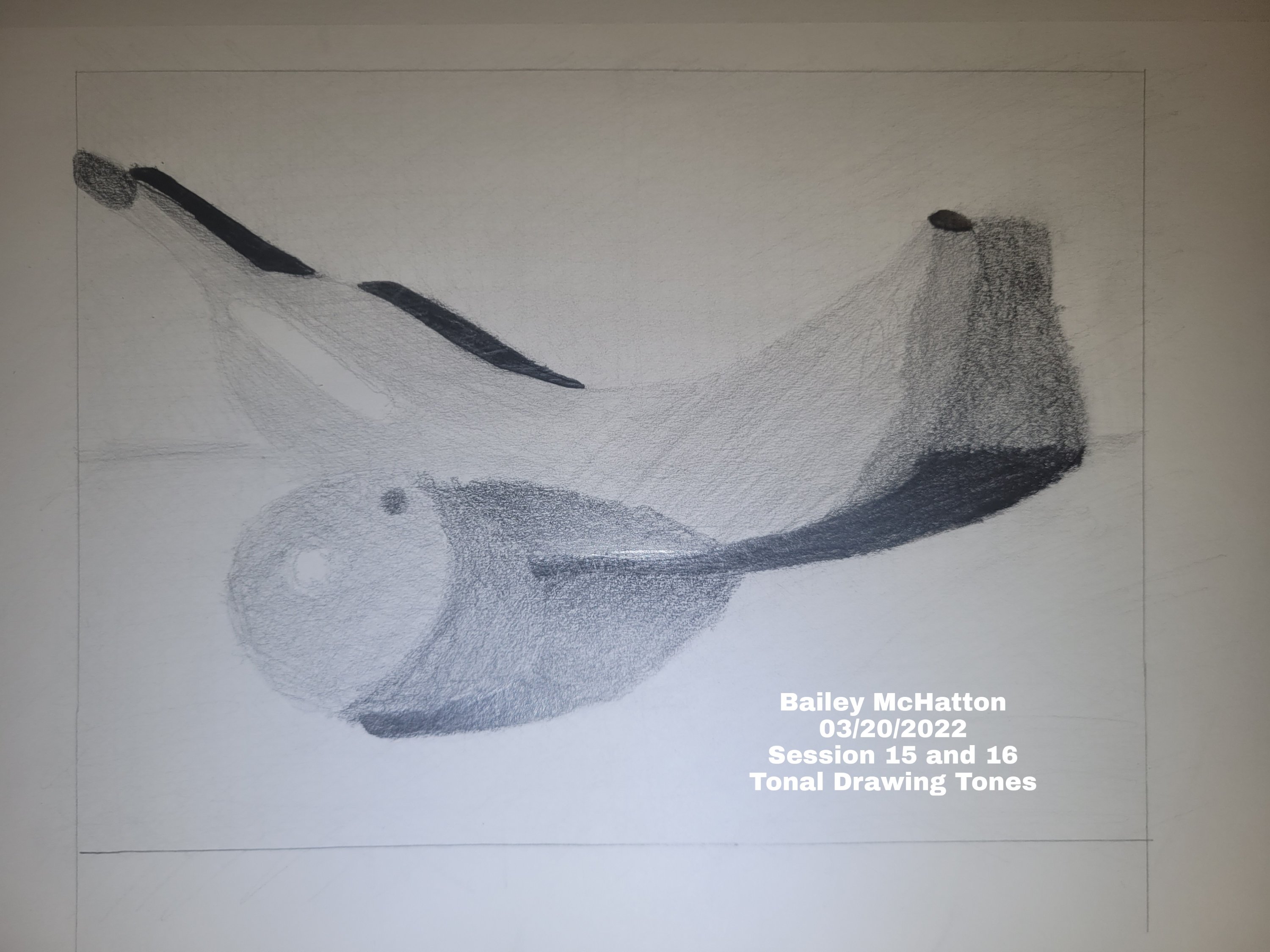
I am looking back at these now, months later, and realizing that my shading has to be a lot better in order for things to look good. Looking at the sketch, I know I can draw things relatively well, but the shading is really where everything fell apart in this session.
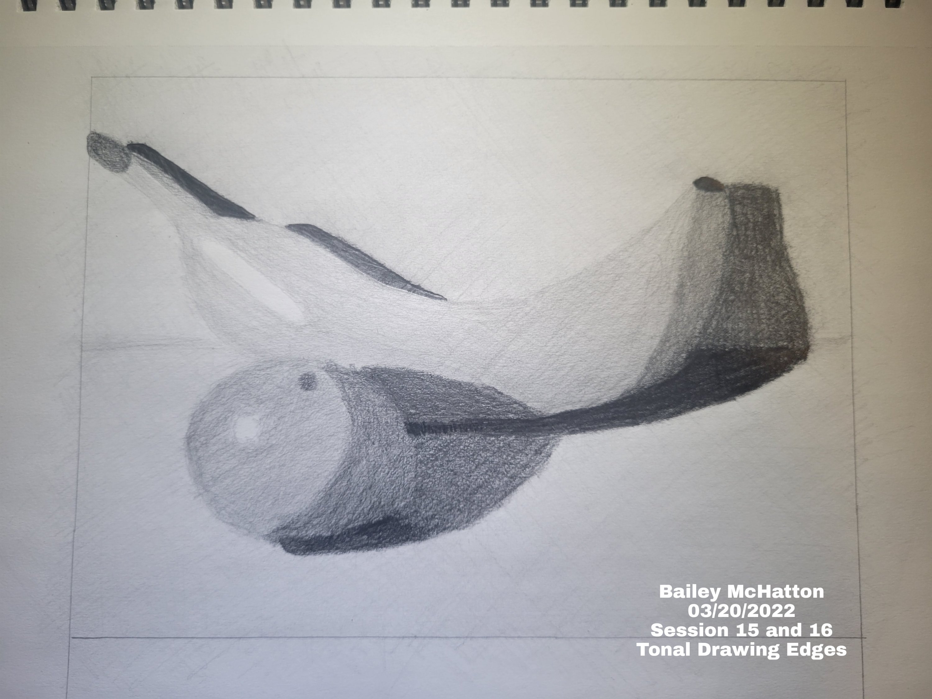
Even just glancing at this, I can tell that all of the pencil strokes are obvious and clear, and I really do not like that. The blending is also really bad in this as well. It wasn’t terrible for a first attempt, but I do know that I can definitely do better.
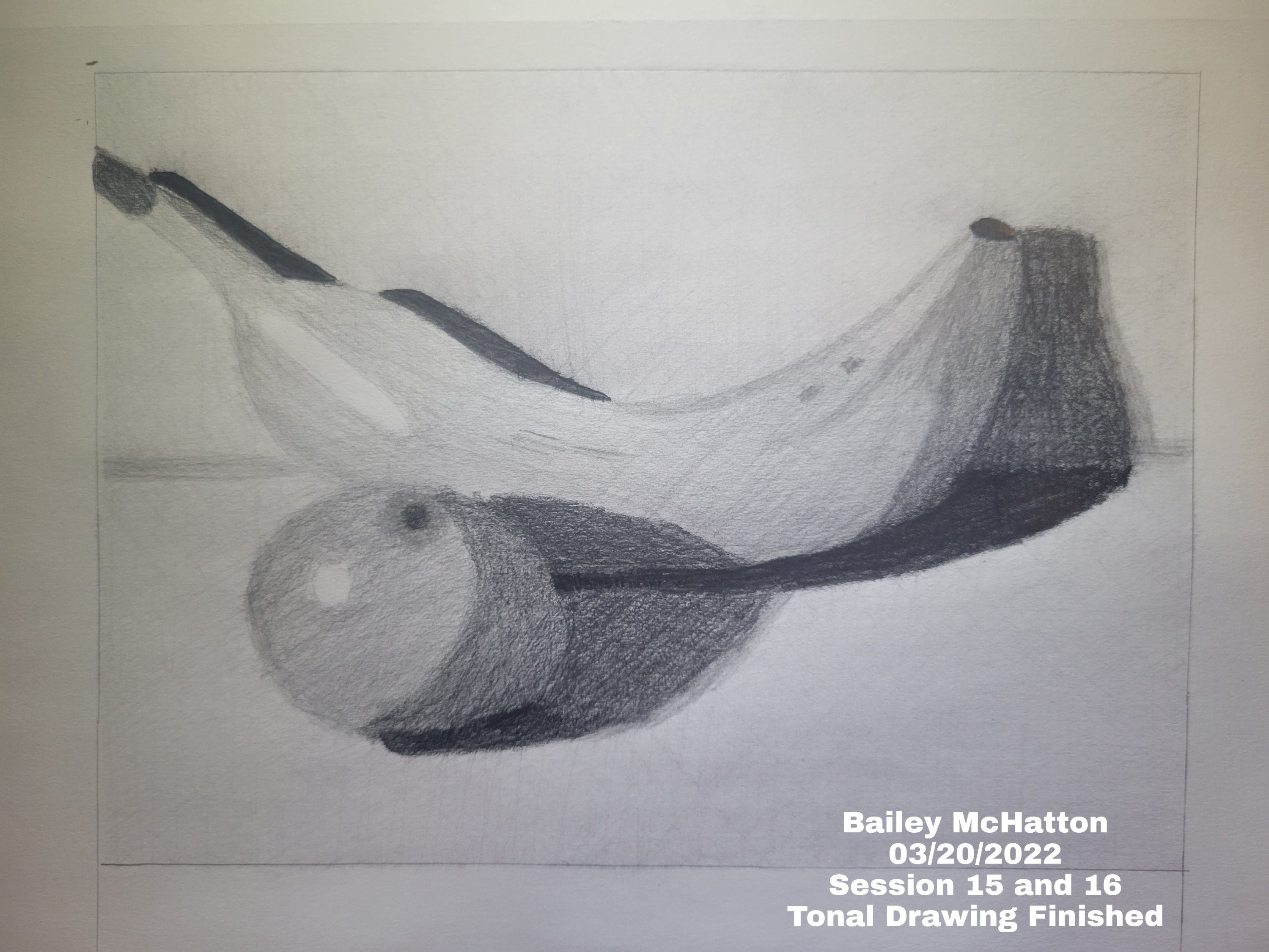
Overall, I am proud that I did this, but not very proud of how it turned out. I do think I can do it better if I do it again, but I’m not sure when that will be. Anyways, that is all I have for you guys for today!
Thank you all so much for reading my blog post and supporting my journey! I really do appreciate every single one of you for sticking with me throughout this whole thing. I will be posting another blog post very soon, so stay tuned for that!
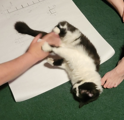
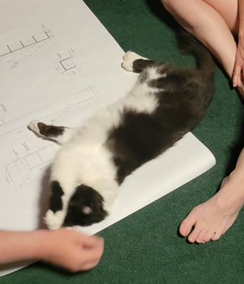
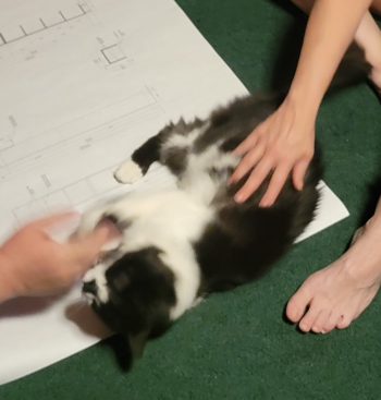
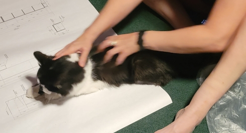
P.S. Here are the very cute pictures of Jack that are promised at the end of every art post that I make. I love him so much and I think he should be shared with the world.

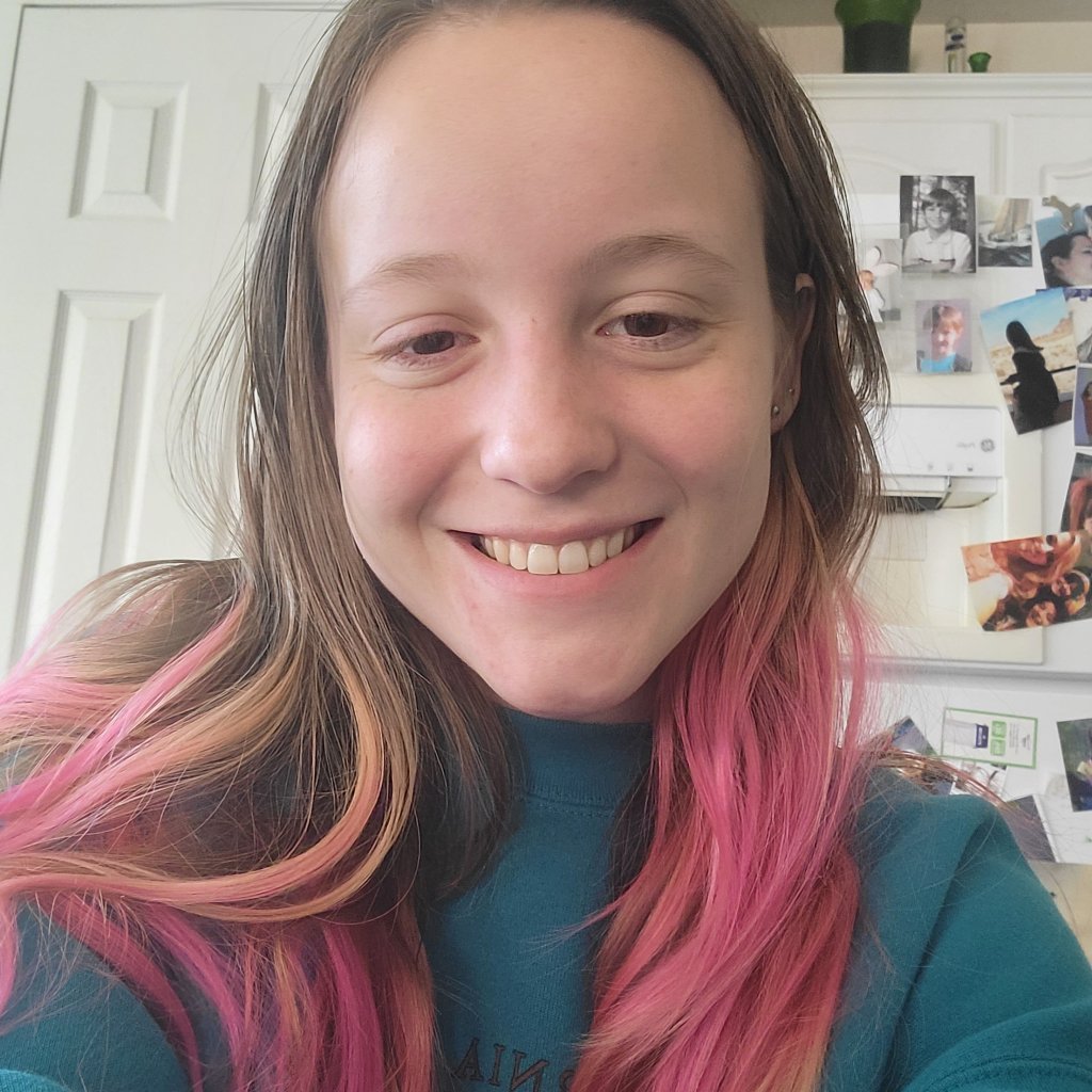
Love the orange hair 😍🧡
Jack is so handsome!
LikeLiked by 1 person
Thank you so much! I really like the orange hair too haha, I’m thinking about going bright orange and bright yellow next. Jack is so handsome, I love him so much ❤ Thank you for commenting!
LikeLike
In your art, I think you’re too critical of yourself. You’re doing something for the first time, and learning. I think you’re doing great!
LikeLiked by 1 person
Thank you! Well, I think there are both pros and cons to being hard on myself, but it’s hard to not do that haha. I appreciate that though. Thank you for commenting!
LikeLike